 Warning: If you are sick and tired of hearing about and/or looking at pictures of The Gates, read no further…
Now that we’ve rid ourselves of the Gate haters, check out some of my photos from this weekend, below. Based on what I have seen in other people’s photos, I would say that the Gates look best in bright sunlight as opposed to the muted light of overcast skies or late afternoon sun. Unfortunately, overcast and late afternoon are what I have thus far. So, I’ve pulled out what I thought were the most interesting shots. In two cases, I resorted to heavy editing to make the shots more interesting (more on that after the break if you are interested).
If you live in or around New York City, I suggest that you take a walk through the park while the Gates are here since this is an installation that is best experienced in person. If you need further convincing, Felix Salmon has written one of the best posts I have read about this event.
The photoblogers are out in full force, for full pictorial coverage, check out Flickr [gates, thegates] and photoblogs.org
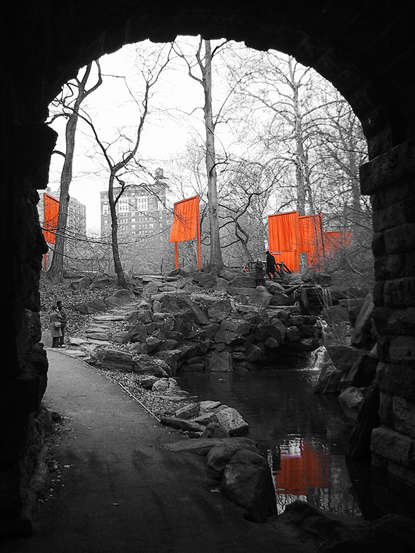
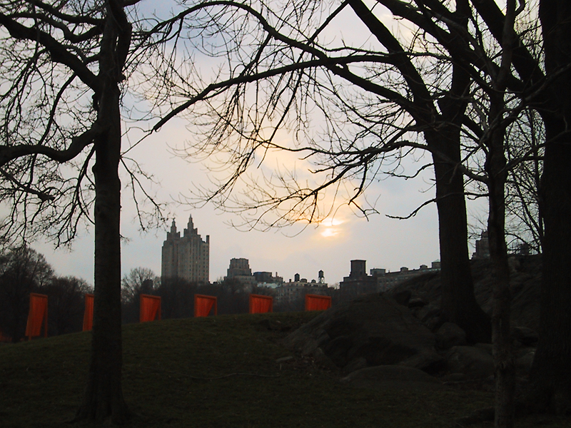

Photo notes…
In an effort to make these pictures a bit more interesting to look at, I tried dropping them to black and white. This didn’t help all that much since the Gates disappeared into the trees without color. So, I tried adding some color back to the gates while leaving the rest of the shot black and white. There are two such pictures in the gallery. I rather like this effect and it is one that I enjoyed using when I shot black and white film. It is a lot easier to do this in Photoshop than it is on paper though: I desaturated the photos and used the history brush to go over the subject(s) in order to bring back their original color. I’m sure there are many other methods for achieving the same effect that might yield better results.