Turbo Tax Deceptive Email Subject
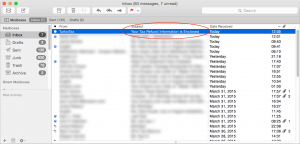
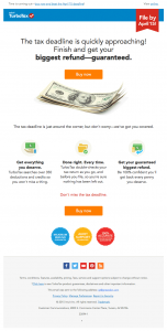
I received an email at the beginning of April with the subject “Your Tax Refund Information is Enclosed”. It certainly caught my attention, but then I realized it was from Turbotax, which I don’t use. Before writing it off as a lame phishing attempt, I opened it just to see just how lame of an attempt it was.

Turbo Tax Marketing Email

I wasn’t entirely surprised to see that it was a marketing email from the folks at Intuit. Obviously, someone had read up on crafting their email subject lines for maximum open rates. It probably eked out more than a few sales of Turbotax, but it just seems so spammy, especially after receiving a few more of these emails before April 15th.

I used to think of Intuit as an upstanding outfit, but this and Intuit’s campaign against simplified tax returns (via ma.tt) will make me think twice before using one of their products at home or at work.
Spotify Cancel 3Spotify Cancelation Screenshot 2A while back, I pointed out a Dark Pattern in Spotify’s subscription cancellation. Today, I noticed that they made some small changes that make the experience slightly less frustrating. The user flow is the same, but if you compare the two images here, you’ll see a minor change. Now, they give equal prominence to the “Stay Premium” and “Cancel my subscription” links. Compare this to the giant, green “Stay Premium” button that was used before. This is a wonderful example of how seemingly insignificant design changes can have an impact on user behavior.

Poor UX and dark patterns are not limited to the web and mobile apps. If you’ve found yourself in a chain restaurant recently, you may have seen a little Ziosk device on the tables. Customers can use Ziosk to order food or pay their tab. According to Businessweek, some restaurants also offer games, for a price:

Chili’s offers unlimited games on the tablets for $0.99, and the chain shares this revenue with Ziosk. The restaurant says about customers at one in 10 tables pay to play during the meal…

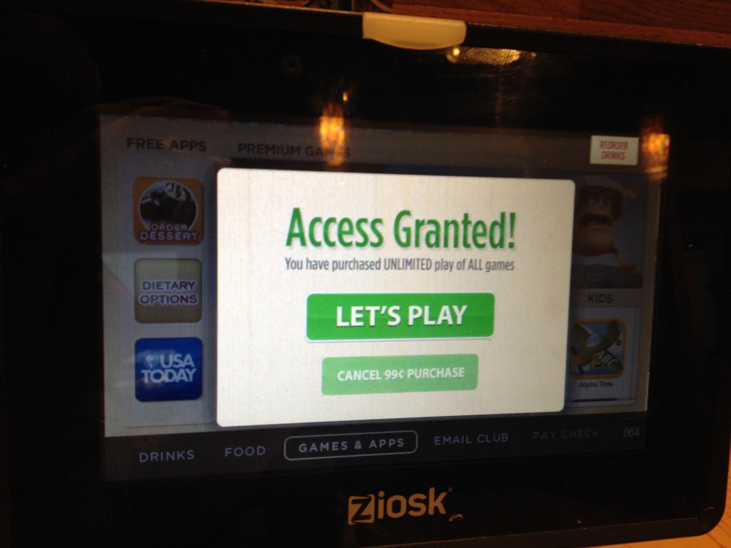
There’s nothing wrong with charging for services, but do customers need to be tricked into parting with their money? Apparently Chili’s and Ziosk think so. Here’s the the screen the user is presented with after answering a random trivia question:

Ziosk Trickery

Look at it quickly. Did the user answer the trivia question correctly? Which button would you choose in this context? Would you choose the massive, bright green button? How many Chili’s customers knowingly spend 99¢ and how many are duped by this dark pattern?

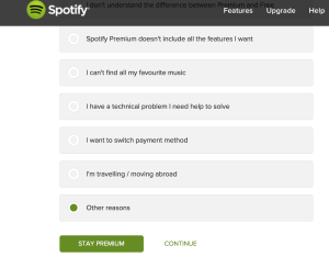
Cancel Spotify Screenshot 1With such a great service, one might wonder why Spotify feels the need to make to make premium service cancellation difficult. Yet, that’s exactly what they do on their cancellation screens.

Note the big, bright green “STAY PREMIUM” button at the bottom of the form shown here. It screams “click me!”, unlike the “CONTINUE” link that fades into the background. When the user clicks on the giant button, Spotify has successfully tricked one of their customers into keeping their paid subscription, right?

While this might seem like a slick, revenue generating idea within the confines of a Spotify conference room, reality is much different. The user has decided to cancel, they’ve entered their password and filled out the form. Rather than happily continue with their membership after being tricked, the user will start the cancellation process again. However, the second time around they will be frustrated. Is this the sort of feeling Spotify wants its users to walk away with?

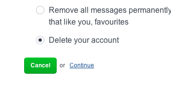
Spotify Cancelation Screenshot 2For good measure, Spotify uses this dark pattern again on the next screen in the cancellation process. Not a surprise from a company that has made the cancellation of their premium service difficult in the past.

Spotify’s users deserve better treatment than this. As I said before, Spotify provides a great service that many people are happy to pay for. There’s no need to trick customers into keeping their service when they are trying to cancel it.

Update 2014-11-12: Spotify made some changes that make this pattern slightly less dark.