Back in 2007, there was some talk about personal unit tests. The idea was to apply unit testing, a tenant of Test Driven Development, to some of the mundane, yet important daily tasks of one’s life. Done properly, one could see what their pass rate was, and address problem areas.
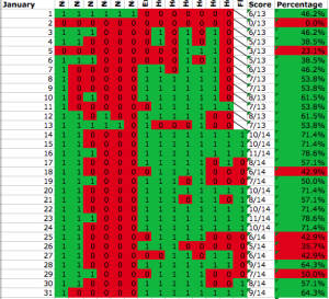
 This sounded like a great idea. I created a spreadsheet complete with conditional formatting to track small tasks like “exercise”, “healthy lunch” and “practice guitar”. While it was useful to see how I was doing, the overhead of tracking all of these little tasks was very high. If it could only be automated, like unit tests in TDD, it would be so much better.
Now, 7 years later, our devices are tracking all sorts of things about us. Perhaps most of these unit tests could be automated by querying the repositories of personal data that are being created. Data that can’t be obtained automatically, could come from something like Reporter. I’ve seen several gorgeous visualizations of this data–Aprilzero immediately comes to mind, but I don’t think they are all that actionable throughout the day. This is where unit tests could really shine, maybe.
