I’ve been wanting to gain some more proficiency in D3.js. I went through several tutorials at some point in 2016, but I really needed a project to work on. More recently, I’ve become interested in Citibike data, specifically, the patterns of available bikes at given locations. Why not graph it?
Citibike maintains a comprehensive dataset of all trip data, but does not seem to maintain a historical dataset for stations. So, I hacked together a python script1 to gather some historical data from the station near my apartment.
I’m a total D3 neophyte, so I found a sample multi-series line chart that I could use to start viewing the data I collected. I hacked another script1 to transform the data into something that would be easier to chart.
After a bit of modification to the sample chart, I got this:
It looks cool, but it’s really not what I was going for, and it’s pretty useless.
After some more work, I’m getting closer:
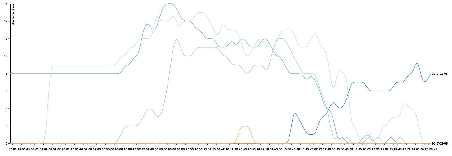
…but, it still needs a lot of work. Specifically, the x-axis labels are worthless. Also, I really don’t have enough data there to show what I want to show. I think I need at least 30 days as opposed to the 7 I currently have. It doesn’t help that the system was closed for a couple of those days due to winter weather.
I’ll check back in a couple weeks to see how it is shaping up.
1The scripts referenced in this post are available at github.com/jpreardon/citibike-station-status.