Background
We wanted an easy way for our guests to get more information about our wedding and RSVP online. While there are many sites that will do this with minimal effort, we wanted to take a more DIY approach.
As usual, I’m about to get detailed. If you’d like to skip the story and just want the basics, skip to the resources section.
The Process
Invitations
We knew we didn’t want to go the route of formal, engraved invitations. My wife did some research and found that a few people had created invitations in the style of boarding passes or travel tickets. We both liked this idea that ticked off a couple boxes: not traditional, and reflective of our love of travel.
Unable to find any boarding pass invitations that we really loved, we opted to design them ourselves, sort of. Neither one of us are print designers, but our good friend, Carl has serious design chops. My wife provided him with a sort of wireframe of all required the information along with links to a bunch of invites she had found for inspiration. With that, Carl created beautiful invitations.
Since we were doing “boarding passes” we thought they should be personalized–like a boarding pass. This would tie into the RSVP site. Rather than making guests type in email addresses to RSVP, they could simply enter a short ticket number. We even toyed with the idea of including a scannable bar code that would open the guest’s personalized RSVP page in a browser. We decided against this because maybe one person might actually try this, and the rest would be confused.
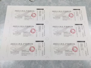 In order to personalize the print invitations, I thought we would do an offset run of the invitations leaving the personalized parts blank. Then, I would laser print the names and ticket numbers on the printed invitations. When I relayed this plan to Andy at G&P Printing there was a long silence, then he suggested an alternative. We should do all the personalization in Illustrator and give him each invitation as an individual file. He would take care of the rest, including cutting and rounding the corners.
I’m so glad he talked me out of my original idea, the invitations came out so much better than they would have if I tried to personalize them. The picture here is from the print shop, before the invites were cut and finished.
The Website
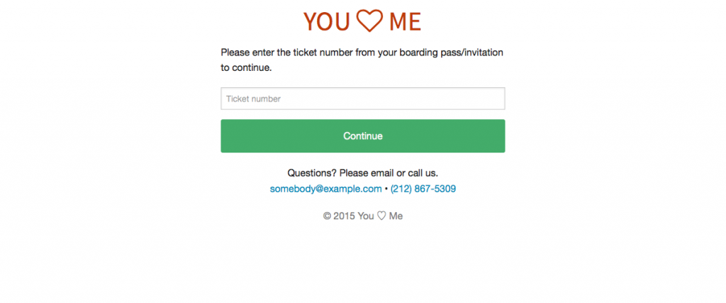
From the start, I was thinking that most people would access the site from their mobile devices. This was one of the main reasons I wanted a simple way for people to RSVP without having to type in an email address. After a false start with one HTML template, we landed on Foundation since it’s responsive and pretty easy to modify. As you can see, the login page asked for minimal information.
The back end for this single page site could be simple, it didn’t need a full-blown application framework like Rails. After all, we only needed to have people tell us if they were attending or not. I used Sinatra since I was familiar with it from working with Dashing. Rather than serving it from my usual host, I used Heroku, mostly for it’s ease of deployment from Git. Both Sinatra and Heroku performed very well. To increase performance a bit, I paid a nominal amount to be on the least expensive tier (above free) for several weeks.
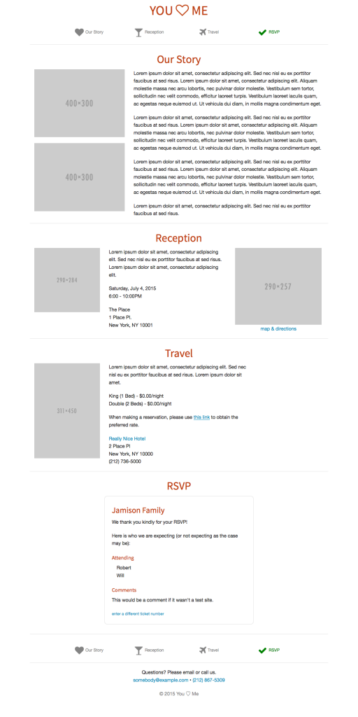
We spent more time on this little site than anyone who saw it would really appreciate, but we had fun doing it and learned a few things along the way. That’s what doing things yourself is all about, right? Below, you’ll find a screenshot of the finished product (I’ve removed the personal information, so it’s all placeholder content). The source for this is available on Github.
Conclusion
This project was a success, but as always, there are a few things I would do differently if faced with a similar project in the future:
- We could have done a better job sizing the invitations to the envelopes. The invites were a custom size anyway, so having them fit better would have required just a bit of advanced planning. In our case, we had focused so much on the invites, the envelops were an afterthought. I should have selected all of the paper goods that we needed before finalizing the designs.
- The site was essentially password protected. Users had to enter a valid ticket number to see the site. We did this for privacy reasons and we tried to minimize the impact to the users by remembering their ticket numbers so they only had to enter them once. This only works in the same browser that was used to enter the ticket number though. No one complained about this, but I think I would forgo the privacy on the informational parts of the site to make it easier to access.
- I quite wrong about people using their phones to access this site. 70% of sessions were desktop, I thought we’d be closer to a 50% split.
- About 25% of the invitees opted to email, text, call or RSVP in person. I’m not sure if these “out of band” RSVPs are the norm with traditional invites, I suspect they are. If I ever plan another event with formal RSVPs, I’ll just expect that a portion of the people will RSVP some other way.
Resources
Here’s a list of the things that helped us along the way:
- Jonnie Hallman’s post on his wedding tech was an early source of inspiration.
- Boarding pass invitation inspiration:
- Envelopes from Papersource
- Invitations printed by G&P Printing, 210 Centre Street, New York (212) 274-8092
- Front end framework: Foundation
- Web application framework: Sinatra
- Site is available on Github
- Hosting by Heroku