jpreardon.com

Main menu

Skip to content
  • Home
  • About John P. Reardon
  • Contact
  • Projects
    • BMW 1200GS Auxiliary Battery and Lighting
    • Bose 901 Equalizer Repair
    • Good Morning Display
    • Homebrew Yaesu FT-857D Soundcard Cable
    • Pomodoro Timer
    • Robusto Tube Amplifier
    • Wall Mounted User Recyclable News Dispenser
    • Wedding Website
  • Pictures
  • UX Bookshelf

Category: Data Visualization

Post navigation

← Older posts

Amazing Weather Display

Posted on 2022-03-12
by JP Reardon

This motorized weather display is amazing. He includes instructions for creating your own.

via Hackaday

Posted in Data Visualization, Design, Electronics | Leave a comment

Responsible coronavirus charts

Posted on 2020-03-22
by JP Reardon

Datawrapper: Responsible coronavirus charts

via Flowingdata

Posted on 2020-03-22
by JP Reardon
in Data Visualization, Linkblog | Leave a comment

2020 Presidential Ad Buys

Posted on 2020-02-07
by JP Reardon

Five Thirty Eight: Tracking Every Presidential Candidate’s TV Ad Buys

via Scripting News
Posted on 2020-02-07
by JP Reardon
in Data Visualization, Linkblog, Random | Leave a comment

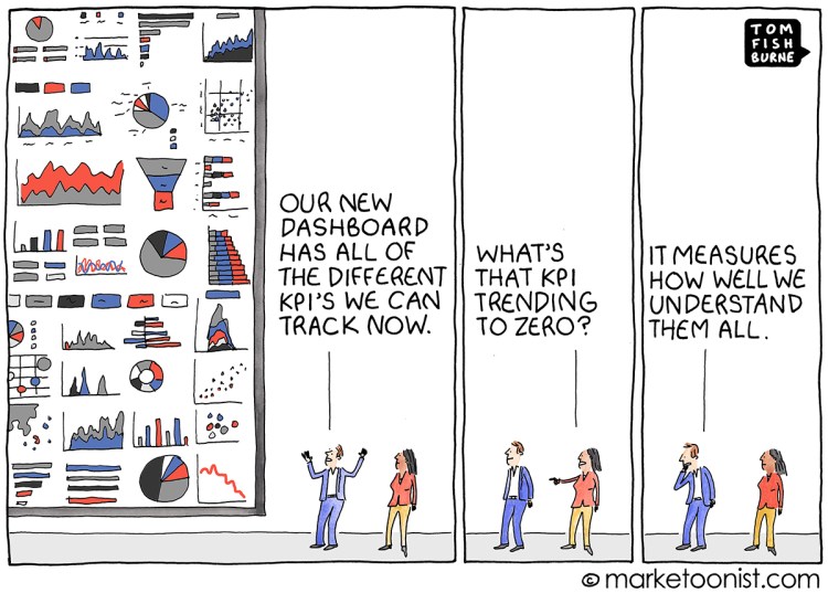
KPI Overload

Posted on 2019-11-24
by JP Reardon
kpi-overload

via FlowingData

Posted in Data Visualization | Leave a comment

Hours of daylight at all latitudes

Posted on 2019-11-23
by JP Reardon

From Reddit user harplass.

via FlowingData

Posted in Data Visualization | Leave a comment

Post navigation

← Older posts

About

JP Reardon New York City USA UX person, generalist, tinkerer. Get more of the story in the about section.

Search

Browse by Category

Linkage

  • Awesome Pearson Ensign Tees @ Vintage Sailors
  • From the Emerald City to the Rising Sun
  • if i didn't care
  • Series of Contradictions
  • Todd Evans

JP Reardon on the web

  • Mastodon
  • Instagram
  • Github
  • jpreardon.com
  • LinkedIn
This site is powered by WordPress and styled with SemPress