Sometimes good people are forced to implement interstitial pages–I get that. However, if you’re forced to do it, don’t make it worse than it needs to be. Take a look at this screenshot from Staples.
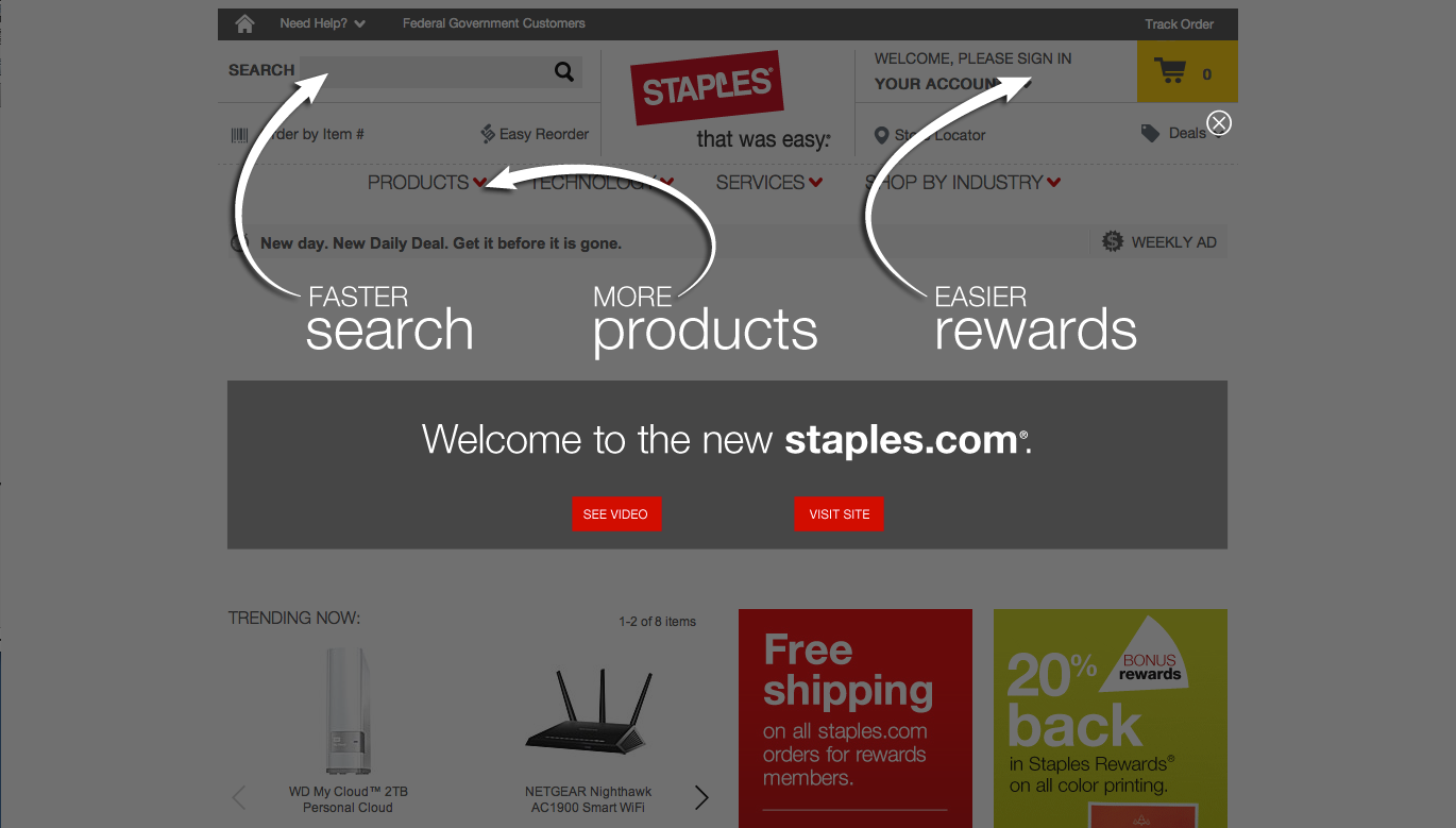
Rather than a full-on interstitial or a popup, they went with this lightbox type thing. Sure it looks cute, but in order to use any of the three functions they are pointing out, one has to click on either the “View Site” button or the close [X]. The two action buttons take a back seat to the big white arrows while the close [X] is misplaced and very hard to see. This makes for a frustrating user experience.
At minimum, they should close this lightbox effect when the user clicks anywhere outside of the lightbox popup. Alternatively, a more subtle tout or fly-in could alert users to the presence of the 1.5 minute “new staples.com” video.